
It’s now been a couple of days since my introduction on Pinoccio. I left my Field Scout in the wilderness that is my workbench, plugging it in occasionally to charge it, and it dutifully checked in with HQ every couple of minutes and reported on its vital signs (remember I haven’t actually asked it to do anything yet!). It’s time to find out what has been happening with it. We can do this using Pinoccio HQ, some Linux command line hacking and some free online graphing tools.
So what data does the Scout report to HQ? The dashboard shows the live temperature and battery status of the currently selected Scout:

This data is logged in HQ as well, and it is possible to use the API to download a history report.
Create an HQ Token
First order of business is to create a new token so we can communicate with HQ using the API. This is done by going to “HQ Settings”:
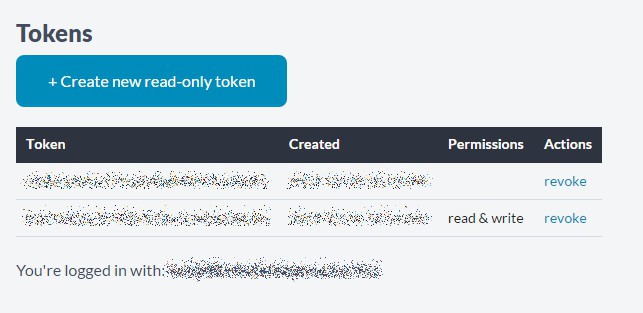
Once in HQ Settings there’s an option for creating Tokens, simply click on “Create new read-only token” and copy the resulting Token string:
Find your Troop and Scout IDs
The HQ API will let you get a list of your Troops and also a list of the Scouts in each Troop. However it’s easier just to click on one of your scouts in your browser and read the Troop and Scout IDs from the title bar. You can see in this example that my Troop is Troop 5 and the current Scout I’m looking at is Scout 2:

Generate your Start/End Timestamps
Finally, we need to know what time period we want to cover and what sort of data we want to retrieve. The timestamps in HQ are all Unix Epoch millisecond timestamps. There is a handy site www.epochconverter.com that lets you convert human-readable dates into Unix Epochs. When converting dates make sure you use the “Timestamp in milliseconds” result. You always need the start time, and if an end time is not specified it will give you a report right up until the present time.
Downloading a Report, and a slight tangent
To get a report out of HQ and process the data, I find it easiest to use Linux command line. What if you use Windows? Here’s that tangent…
Pinoccio is fully Arduino compatible, although the official Arduino releases haven’t caught up with the chip that Pinoccio uses (ATMega256RFR2). There is a preconfigured virtual machine available with the correct Arduino version and Pinoccio libraries preconfigured. This is a Linux VM, which has the additional benefit of providing the command line tools I used to retrieve the data and process it. If you have a Raspberry Pi handy you can use that command line instead, but you won’t get the Arduino side of course!
To use the VM you will need to install VirtualBox (free) and some sort of torrent software. There is a magnet link (a special kind of torrent URI) on the Pinoccio firmware repository on Github. Download the VM torrent, then in Virtualbox go to File menu -> Import Appliance. Import the Pinoccio VM image and start it up. The default login is “user” with no password.
Being a command line hack-and-see sort of guy, I used a utility called curl followed by some other builtin linux utilities to translate the HQ data into a format that can be easily graphed. If curl is not installed in the VM then opening a terminal and typing “sudo apt-get install curl” should install it. Also we use the extended feature set of gawk so “sudo apt-get install gawk” will provide it.
Recap, and some command line hacking
We have a few bits of information to feed into the Linux command line:
- API token <token>
- Report type <report> (we will use “temp”, shorthand for temperature report)
- Troop and Scout IDs <troop> <scout>
- Start (and optionally End) times <start>
Here’s my scary looking command line:
curl -s 'https://api.pinocc.io/v1/stats?token=<token>&report=<report>&scout=<scout>&troop=<troop>&start=<start>&tail=false' | tr ':,' ' ' | tr -d '{}\"' | gawk '{ print "['"'"'" strftime("%y%m%d-%H%M",$22/1000) "'"'"'," $14 "]," }'
What the heck does this do??
Curl will request, from the API, a set of data which will be returned to the terminal window. The pipe symbol ‘|’ is used to direct that output into some other commands. The raw output of the curl command will be a JSON report (this happens to be a power report, but the temperature report is very similar):
{"data":{"account":"19","troop":"1","scout":"1","type":"power","value":{"type":"power","battery":96,"voltage":415,"charging":false,"vcc":true,"_t":1395176893461.001},"time":1395176893461.001}}
{"data":{"account":"19","troop":"1","scout":"1","type":"power","value":{"type":"power","battery":96,"voltage":413,"charging":false,"vcc":true,"_t":1395176943720},"time":1395176943720}}
{"data":{"account":"19","troop":"1","scout":"1","type":"power","value":{"type":"power","battery":96,"voltage":410,"charging":false,"vcc":true,"_t":1395177123715},"time":1395177123715}}
{"data":{"account":"19","troop":"1","scout":"1","type":"power","value":{"type":"power","battery":96,"voltage":418,"charging":false,"vcc":true,"_t":1395177183714},"time":1395177183714}}
We don’t need most of that, we just care about the timestamp and the data point. The other commands we piped into will reformat the data to output something that we can graph. I should point out that I am less comfortable with JSON and more comfortable with command line utilities. There are many ways to process this data! Anyhow, the first two piped commands are “tr”. This is the translate command. It removes the JSON formatting and inserts whitespace, which gawk (and this particular human) is more comfortable dealing with. The gawk command divides the millisecond timestamp by 1000 and then converts it into human-readable format. This is also neat because the timestamp is in epoch (referenced to UTC) and the strftime() function takes your locale into account and converts it into local time!
I ran a request for “temp” report data and my output from the command line looked something like this
['141104-2055',11],
['141104-2056',11],
['141104-2057',12],
['141104-2059',13],
['141104-2100',14],
['141104-2101',14],
['141104-2103',16],
['141104-2104',16],
['141104-2105',16],
['141104-2106',16],
['141104-2106',17],
This is simply the date and time in YYMMDD-HHMM format along with the temperature in degrees Celcius. Using the above gawk statement I’ve optimised this formatting for Google’s free graphing API.
Pretty graphs
Google provides a free graphing library for websites, and there’s an online javascript prototyping website called JSFiddle that lets you play with some webby things while prototyping. I’m an embedded electronics engineer so web stuff is a little outside my comfort zone, but it wasn’t difficult to get these two to play nice together.
I saved a JSFiddle that demonstrates the concept here, feel free to play with it:
http://jsfiddle.net/mLe9hjbh/2/
The dataset in the JSFiddle I saved is pretty obvious, you can paste in your own data and hit “Run” and the graph will update. I ran a “temp” report and a “power” report for the last 2 days and here’s the result:
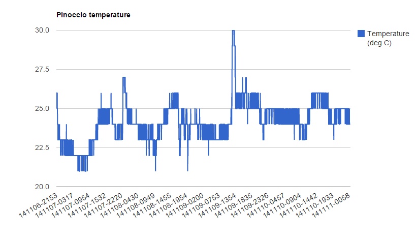
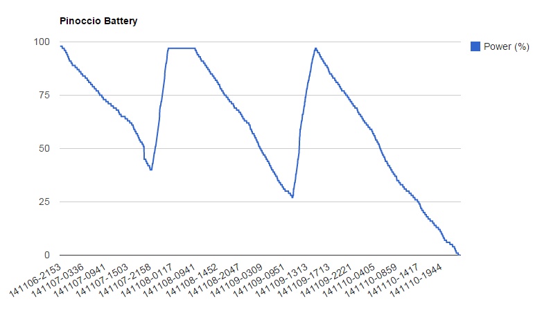
Neat, huh? You can see that the onboard battery lasts a bit over a day with the Scout fully powered up and running at all times. The battery life can be greatly improved by using the power.sleep() command which we will play with in the next project.
![]()